Color deeply influences the overall look and feel of a website and can form the first impression about a company for visitors.
What do consider when developing a color palette
Companies and clients will often have a set of colors used in the corporate logo that they want implemented in the site design. It’s the web designer’s job to educate the client about how those colors will fit into the site’s style and gently encourage changes if necessary.
Colors have different meanings in different cultures and countries, so understanding the meaning of color in your target market is important. Here are some general guidelines for color codes:
- Blue is associated with stability, trust, and confidence. It is an excellent color for credit card website or other sites needing to inspire confidence.
- Black represents elegance, wealth, sophistication, and mystery.
- White symbolizes peace, purity, and simplicity.
- Orange represents warmth, enthusiasm, or warning.
- Red is associated with strength, power, love, and desire.
- Green can represent nature, health, vigor, and community.
- Yellow is often associated with brightness, happiness, idealism, and hope.
Text colors
Text is harder to read on a monitor than on paper so the choice of background and font colors is supremely important. Readability of text is the primary concern. If the text is light colored, then the background must be dark and vice versa. White and black are the most common combination and red and blue are useful for link and highlighted text. Contrast is important for making text readable, so avoid dark backgrounds with text of too similar a tone.
Browser-safe colors
A common problem when attempting to build a web design around an established set of logo colors is that Pantone colors do not always reproduce accurately in browsers. When a non-browser safe color appears in a website, browsers will adapt by shifting the color. Some computers with aging graphics hardware may also fail to display colors correctly.
The best way to avoid this issue is to stick to the “browser-safe palette” of 256 or 216 colors (for really conservative designers). These colors are designed to be accurately displayed in all browser and hardware environments. While some designers (and clients) may find this limiting, it is the only way to ensure that a site is always viewed at its best. By limiting colors this way, designers can ensure that file sizes are smaller and that the site will load quickly.
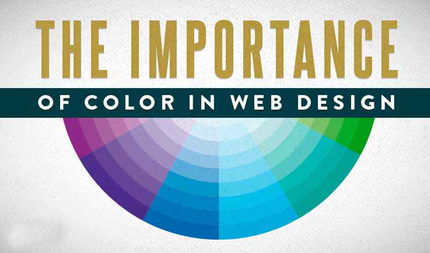
Color psychology
Designers of all stripes know that colors can be organized into groups based on the feel they give a viewer. They fall into three basic categories, and sites incorporating colors from each group can have a more balanced feel.
Cool colors:
Cool colors have a calming effect. A site dominated by cool colors can appear impersonal and cold, but used in combination with warm or neutral colors, they can be comforting.
- Blue
- Green
- White
- Turquoise
- Silver
- Gray
Warm colors:
Warm colors rev us up and get people excited about what they’re seeing. Warm colors convey emotions ranging from optimism to violence. However, too much can be jarring and overwhelming to visitors.
- Red
- Yellow
- Pink
- Orange
- Gold
- Brown
- Black
Neutral colors:
Neutral colors make good backgrounds and font colors and can serve to unify mixed color palettes. They can also help focus attention on the central colors or tone down color combinations that might otherwise be overwhelming.
- Black
- White
- Gray
- Ivory
- Brown
- Beige