The thing about logos (especially for companies as large and as ubiquitous as Google) is that people often form bonds with them without even noticing it. And when a logo is redesigned or changed in any way, you’re more than likely going to have some strong reactions, one way or another. I know I did.
Think about the logos you grew up with and try to imagine how you felt when they changed or when they were redesigned. Yahoo! redesigned their logo a couple of years ago and it was met with criticism. Spotify just changed the color of their logo and many people expressed their discontent. These logos and symbols carry lots of meanings and associations and even a slight change can automatically alter those meanings for us. And a change we’re not comfortable with ultimately brings negative feelings and thus, negative impressions.
So what then, is the difference between a successful redesign and a doomed one?
Impressed with Google’s recent redesign, I set out to learn more about what went into their process and I came upon this blog post from the Google Design team which offers some insight into their approach to the new redesigned identity.
A logo redesign (whether it’s for a small company or a huge corporation) isn’t about just “a new coat of paint.” It isn’t just about finding the perfect balance, flow, legibility, and whatever graphic design lingo you want to throw around. No, a graphic redesign — at its core — is about something much simpler (or more complex, depending on how you look at it). It’s an acknowledgment of the past with an eye towards the future. It’s about taking your best qualities as an organization and refining it to remain relevant for the things to come.
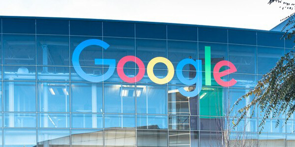
I think this is why Google’s redesign has left a positive impression on me. After learning of Google’s restructuring into Alphabet recently, I was indeed a little worried about what kind of company Google was going to become. Given that “Search” is one of the most powerful forces on the internet for quite some time now, Google’s redesign feels like an affirmation — or at least a statement — that Google will still be the Google we know… but slightly different.
With the new logo, Google remains quirky and fun and lighthearted but a little grown up. At least it seems that way for now.
Source:
Author: Design Instruct
Website: webfx.com